


TLDR
Duration: 2 Months
Role: UX/UI
Process:
User Research
Analytics
Feature Set
Wireframes
Hi-fidelity Mockups
Usability Testing & Iterations
What’s the problem?
There is a disproportionate amount of total users, versus active users on Duolingo, and the average session duration doesn’t result in noticeable improvement in user’s language skills. In simple english; people love duolingo but people fall off the learning track A LOT.
What’s the solution?
Use Duolingo’s users to motivate each other with some healthy competition; user to user gameplay, and an update on streak competitions.

How it started
Learning a different language is a useful skill and learning as an adult has its pros and cons. Research suggests that immersion into a language/culture is the best way to really learn, however most of us can’t drop everything and move to a different country for a few months. Duolingo relies on repetition as a method of learning, and practice arguably makes perfect. Where it fails, I believe, is making the learning experience more applicable to its individual users.
The key problem I was trying to solve, at first, was the lack of immersive learning opportunities within Duolingo. The overarching issue was the low rate of user retention.
Competitive Analysis
For this case study, a competitive audit was the place to start. There are a lot of language learning resources and it’s important to know how others are solving problems, and whether there are holes in the market that need filling.
Interviews
I interviewed multiple people about their experience with language learning apps, in general, and Duolingo, specifically. Here’s what I found:
All users I interviewed began their language education in a traditional academic environment (grade school.) This seems rather universal these days; children in America are learning second languages earlier, which I would say is positive!
Everyone had at least tried Duolingo, and almost everyone had fallen off their usage of the app.
All of the users felt the app was easy to understand and navigate, but ultimately did not find long lasting results, and lost motivation.
In terms of interface, users expressed enjoying the overall look of Duolingo, with one shared complaint: the icons on the navigation bar didn’t clearly explain what page they would take them to, or what can be done within that page. Some expressed never even using some of the icons because they seemed redundant, for example the treasure chest versus the trophy.

How its going
The biggest challenge in learning a language is practicing, and immersive experiences remain the most effective way to learn. This makes product design for language learning pretty challenging!
SO, how else might we engage and encourage users in more practice?

Design
First I did some wireframes in my sketchbook. Because I was working within Duolingo’s brand guidelines, I worked in the Mid to High-fidelity stage for the majority of this process .
Here’s what I added and changed:
I added a dictionary widget, making an additional entry point and a faster way to search a word.
I added games where a user can play against another in real time
I changed the navigation bar, adding a page for the new game feature and rearranging the icons based on user priority
I changed the streak feature by adding more specific measures of progress, like vocab or minutes learned.
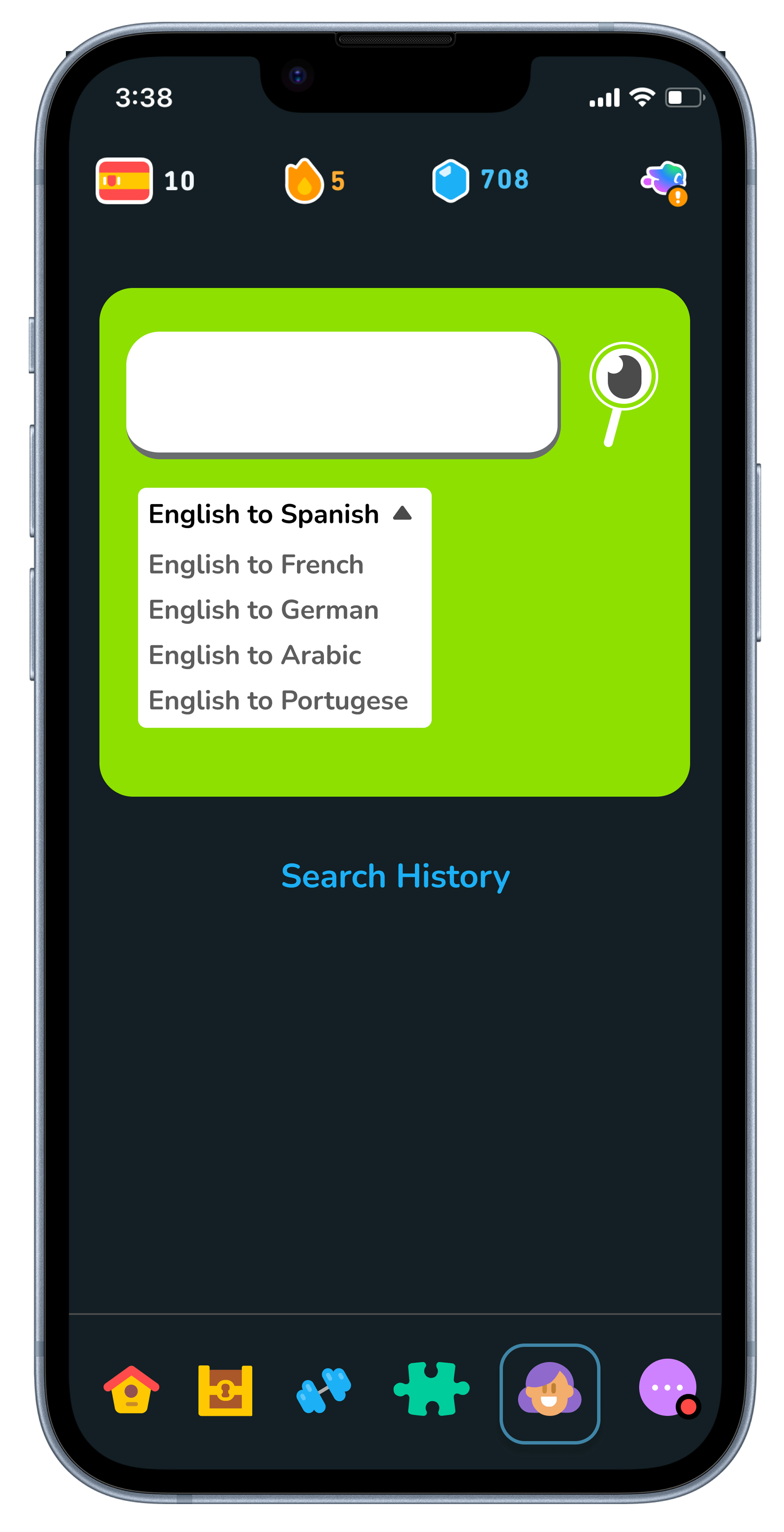
User Flow: from iOS Control Center, use translate widget to jump to translation page.
-
![]()
Widget within control center that takes you right to translation dictionary
-
![]()
Translator page
-
![]()
Choose the language you're learning
-
![]()
Search for word
-
![]()
Results include common phrases and related vocab
-
![]()
Search history of all words searched


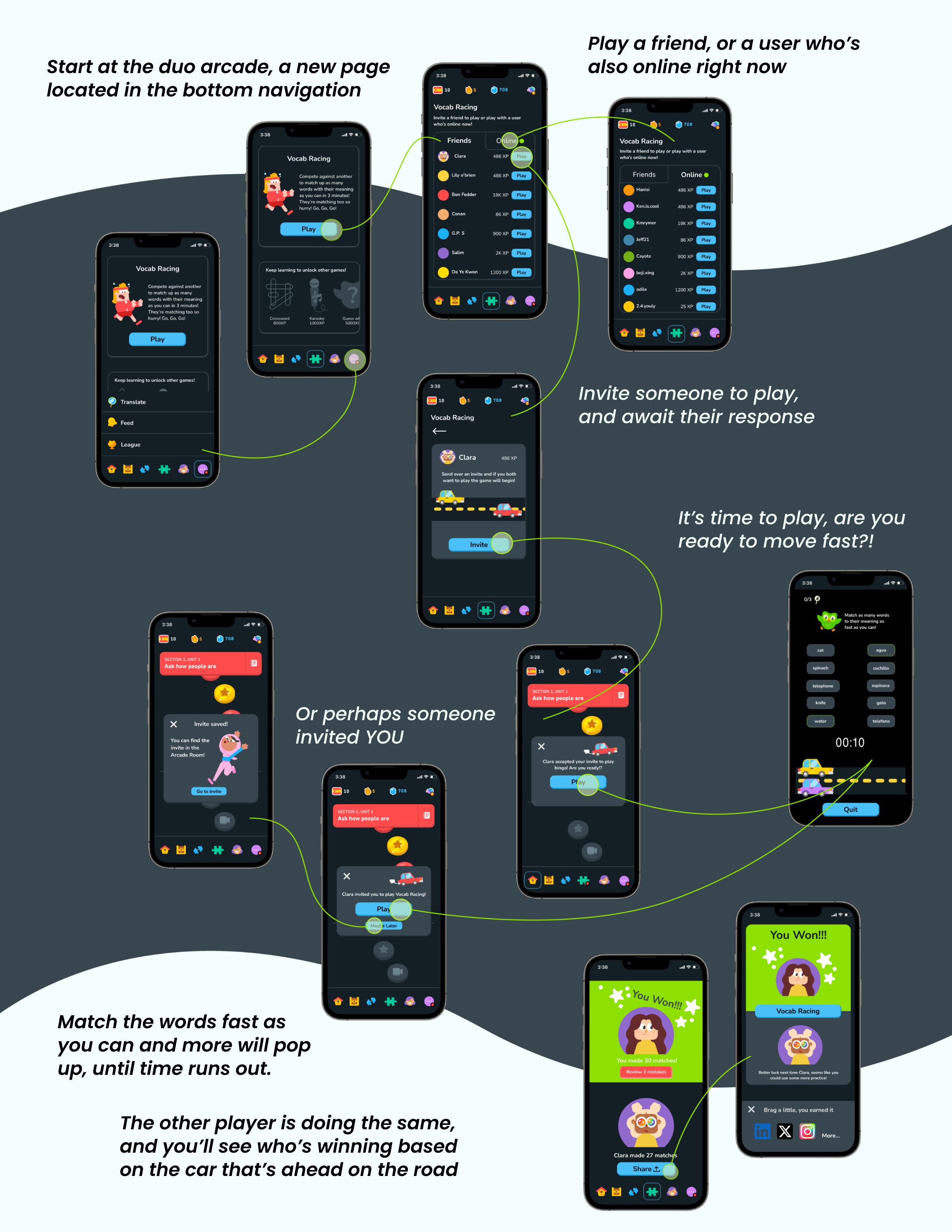
User Flow: invite friend to play Vocab Racing
While I was in the middle of this project, Duolingo launched a game where you try to define as many words as possible under a ticking clock, and you can compete with someone else.
Sound familiar?
This is actually great news, that duolingo’s solution was similar to mine, as it validates my work. There is still a difference in my solution versus Duolingo’s. Duolingo’s game doesn’t have two people playing against each other, in real time, at the same time. Two player games ensure two users are practices. Duolingo only ensures one.
User Flow: invite a friend to “Minutes Learned” Streak competition
-
![]()
find your friends within your profile as usual
-
![]()
There are two new ways to challenge users to a streak; vocab and minutes spent learning.
-
![]()
When a friend agrees to the challenge, both your progress and your friend's will be visible within the streak page.
-
![]()
Coming Soon; a streak page that includes vocab and minutes learned streaks, both personal and between friends.


Navigation Bar
When I was working on this project Duolingo’s nav bar had 8 buttons:

“etc.,” indicating there were more menu page options. When expanded there were two more options: Feed and Profile.
During my user interviews I asked each user about their use of the navigation page.
Interviewers expressed some confusion about the difference between Quest and home, but ultimately were happy with everything except for the Super Duolingo page.
This is a situation where business goals overshadowed user’s needs.
Anyone without premium (Super Duo) gets ads after almost every completed lesson to join premium. Additionally, if an non-premium user visits the Practice Page, they will find many of those features are exclusive to paying members. Clicking on a restricted feature brings a pop-up to pay for premium.
So, there are multiple ways a user is invited to join premium.
I rearranged the navigation icons, adding a new page, Game Room, in place of the Super Duo page.
Prototyping
More streak options to challenge your friends
Vocab Streak- how many words can you learn in a week?
Minutes learned- how much time have you spent learning?
Invite a friend to play vocab racing
See how many words you can match while racing the clock and another user. You have three hints to use within the game, should you choose.
Testing
What’s tasks were tested?
Invite another user to play Vocab Bingo and then play game.
Using the control center widget (iOS only), open the search to translate tool in Duolingo. Then, locate the language settings and the search history.
Invite friend to a vocab, minutes learned, or regular streak.
How did users respond?
All users found the tasks simple to understand and the actions easy to locate from the duolingo navigation bar. Users expressed it would be fun to play against a friend or another user online. Users expressed being able to quickly search a word is useful, and enjoyed the widget design very much! Use of searching a word during game play did not feel as necessary to users, but nice to have.
What’s Next?
Possible next steps would be to do more interviews with users about game play and the streak update. Are they using these features? Why or why not?
Find more use cases for the translate widget. Can it sit within text messaging? Can it exist as a web browser plugin?
An updated Streak Overview Page that includes the vocab and minutes learned streaks. Check back soon.